Open shelving has been a trend for decades! This design feature offers a stylish way to showcase decor and give your otherwise flat walls a bit of character. You can bring your walls to life by installing floating or open shelving but you’ll need to understand how to style the shelves in order to achieve an eye catching look.
The Principles
Before throwing objects onto the shelves, you need to understand a few basic design principles. Some people are naturally gifted at this and don’t really understand why, they just know how to do it. If that isn’t you, check out my tips below:
Rhythm
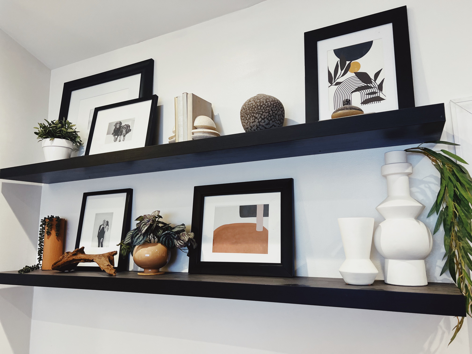
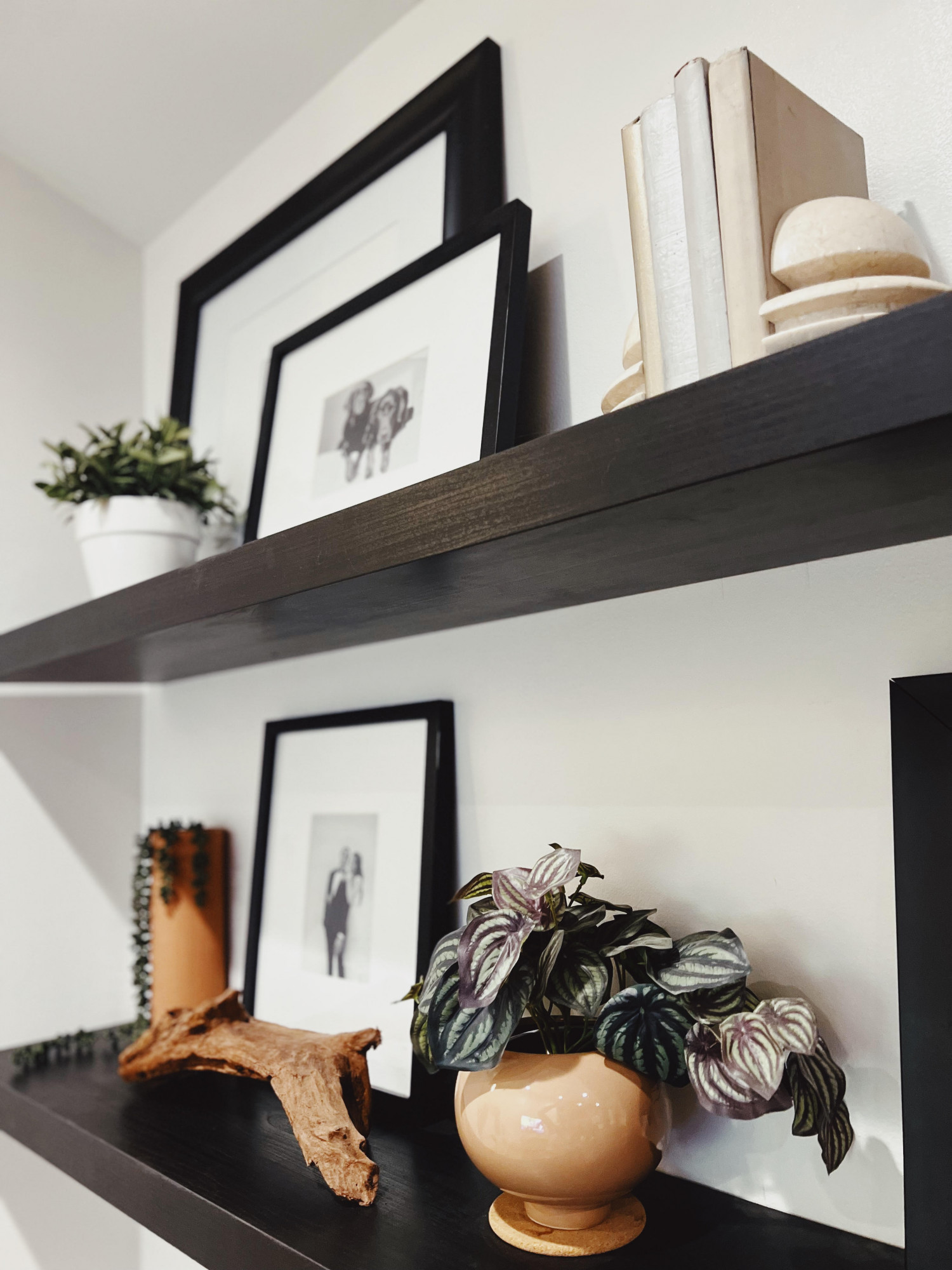
Place objects of similar height farther apart from each other. You want the eye to flow from object to object without getting stuck on one particular piece of decor.
Shape
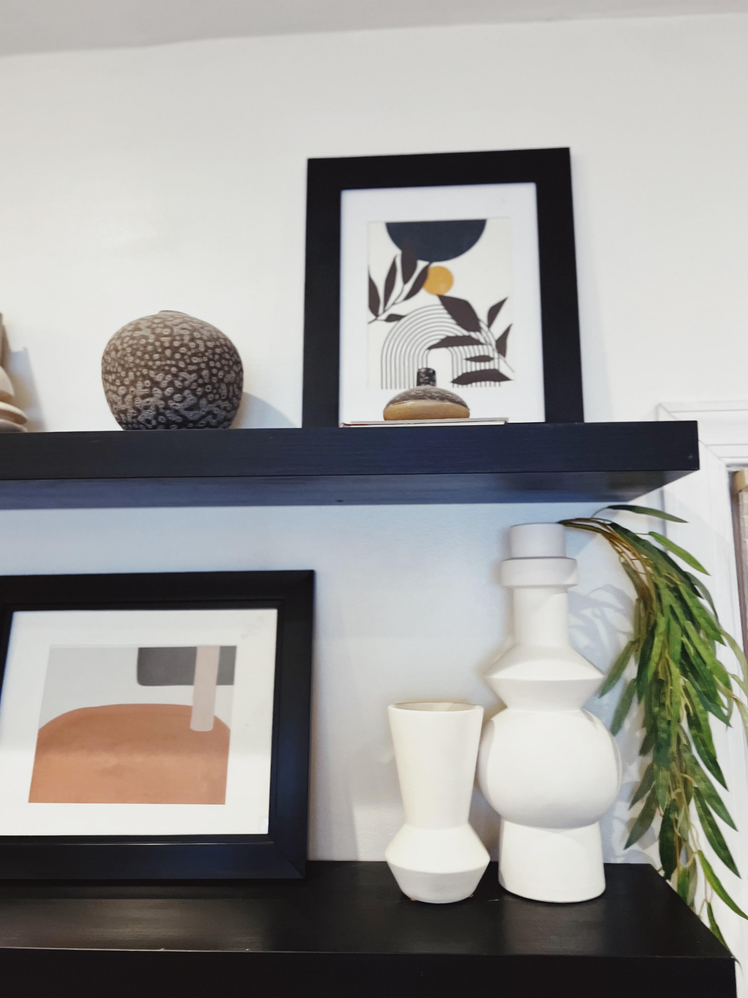
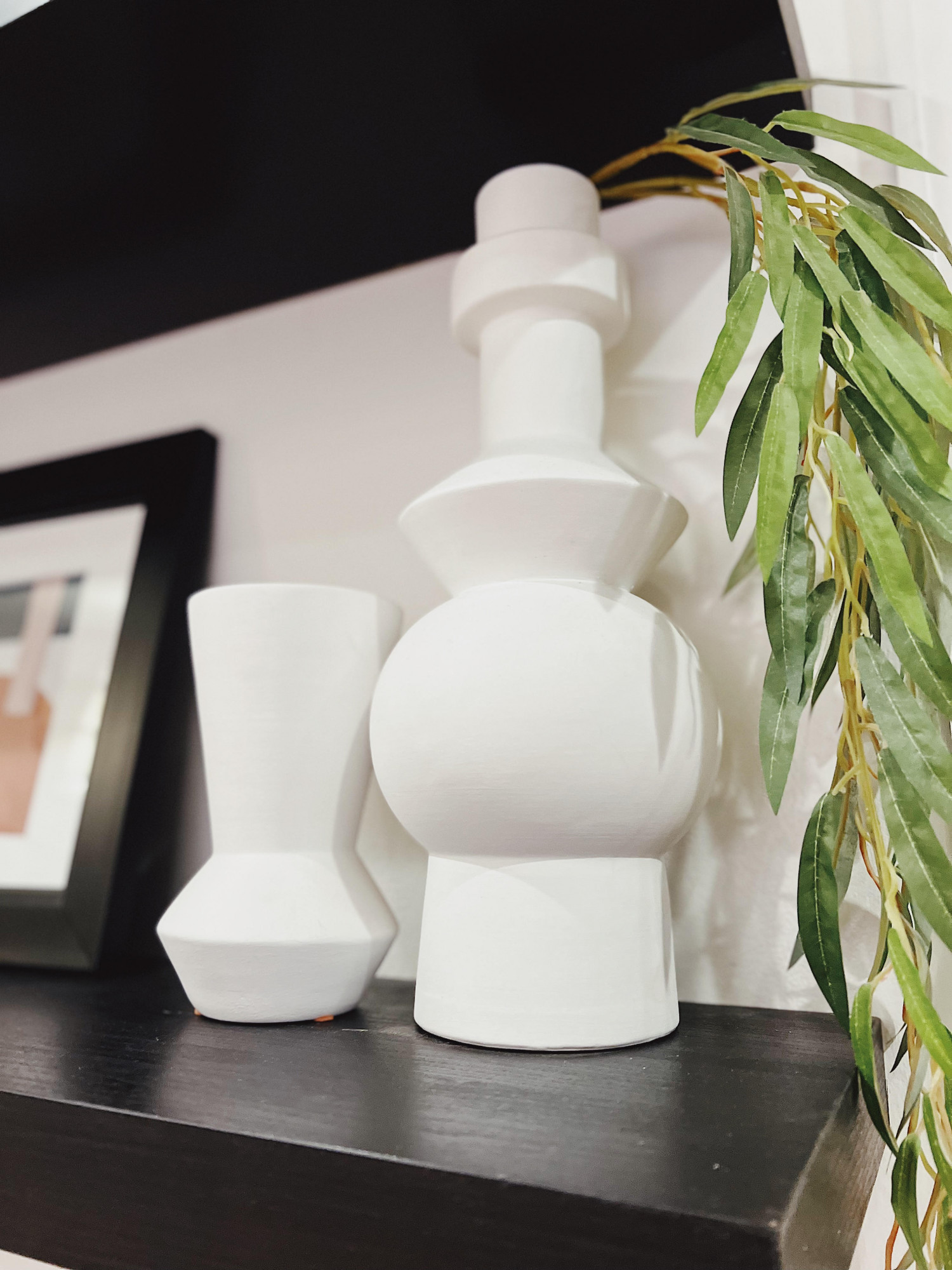
Objects that have a similar shape should be spread apart. However, you can add two similar objects directly next to each other to create repetition. Repetition or pairing is a great way to add to the movement of the space.
Pattern/Color/Texture
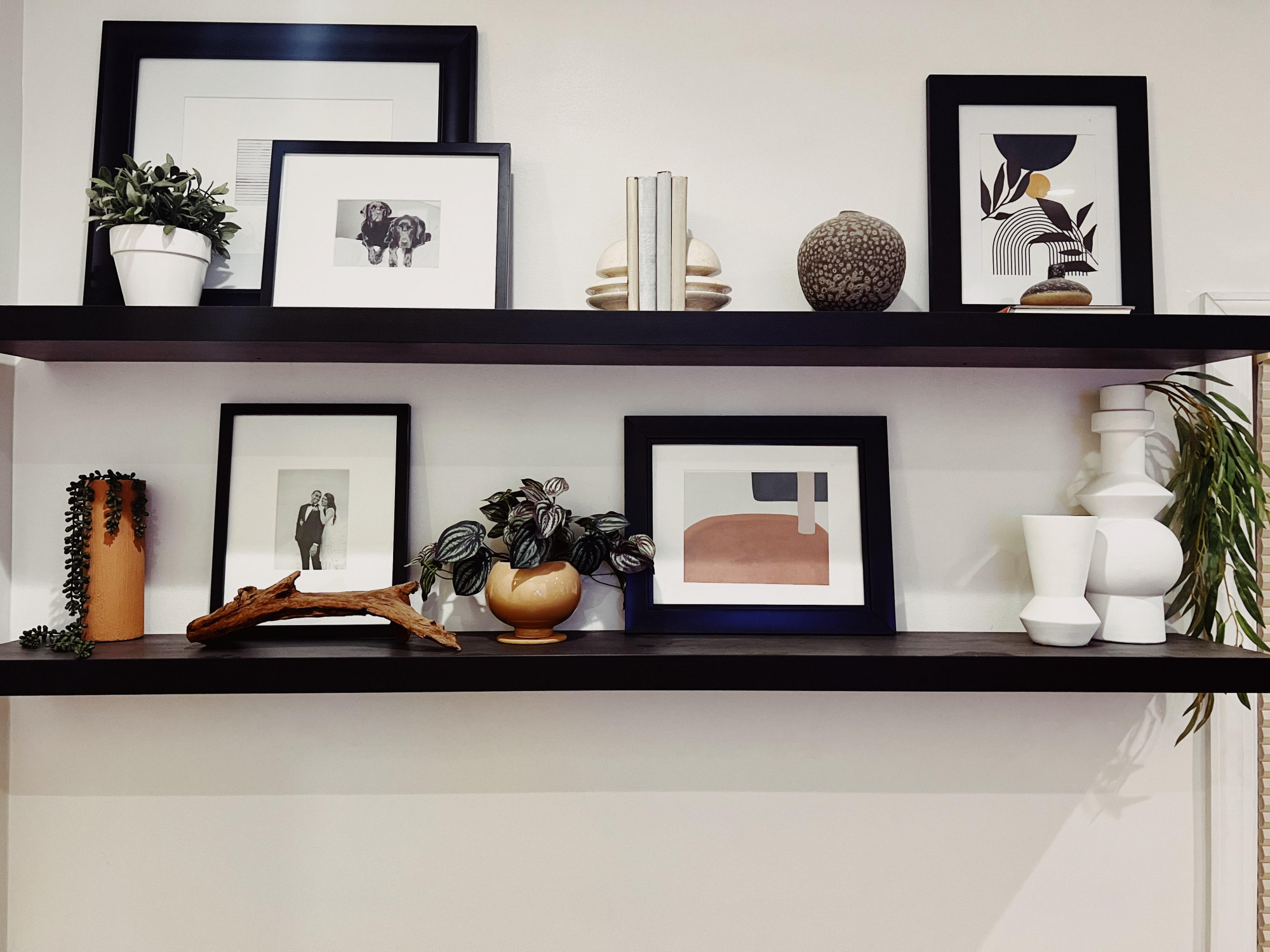
Again, spread apart similar colors/textures/patterns to help the eye move. See how I spaced apart the greenery on my black shelves? When similar colors/textures/patterns are paired next to each other, the eye will quickly gravitate towards that area. Think about it this way. If you see a family wearing all white shirts in a park, your eyes will shift to them right away! This can be a good thing, you just need to understand how to create impact in a visually balanced way.
See how I added two white vases next to each other? Your eye doesn’t get caught on them because of a few reasons. The white negative spaces between the black photo frames is the same color, so it helps to balance the color distribution and move your eyes around the shelves. Making sense now? Not to mention, the inside part of my photo frames contain white as well. Imagine if the photos inside the frame were all black AND the frames AND my wall were black. I can guarantee you your eyes would go STRAIGHT to the white vases! I hope that helps to explain color a little better. It can be tricky, but you’ll get the hang of it.
Let me give you another example using texture. Do you see the lines in the top left photo frame? They are horizontal. Kinda hard to see in my photos. Now look at the books in the middle of the top shelf AND the piece of art directly below it. The books and the art have vertical lines. I purposely put the vertical books next to the horizontal lines to create contrast. However, I also paired the books near the art below because the art ALSO has a vertical line in it! The lines compliment each other nicely and help to create COHESION. Cohesion in design is so important. It’s like when you mix together a bunch of ingredients and they come together to make the perfect tasting cookie. You want your decor to compliment each other in the best ways possible.
Just Practice!
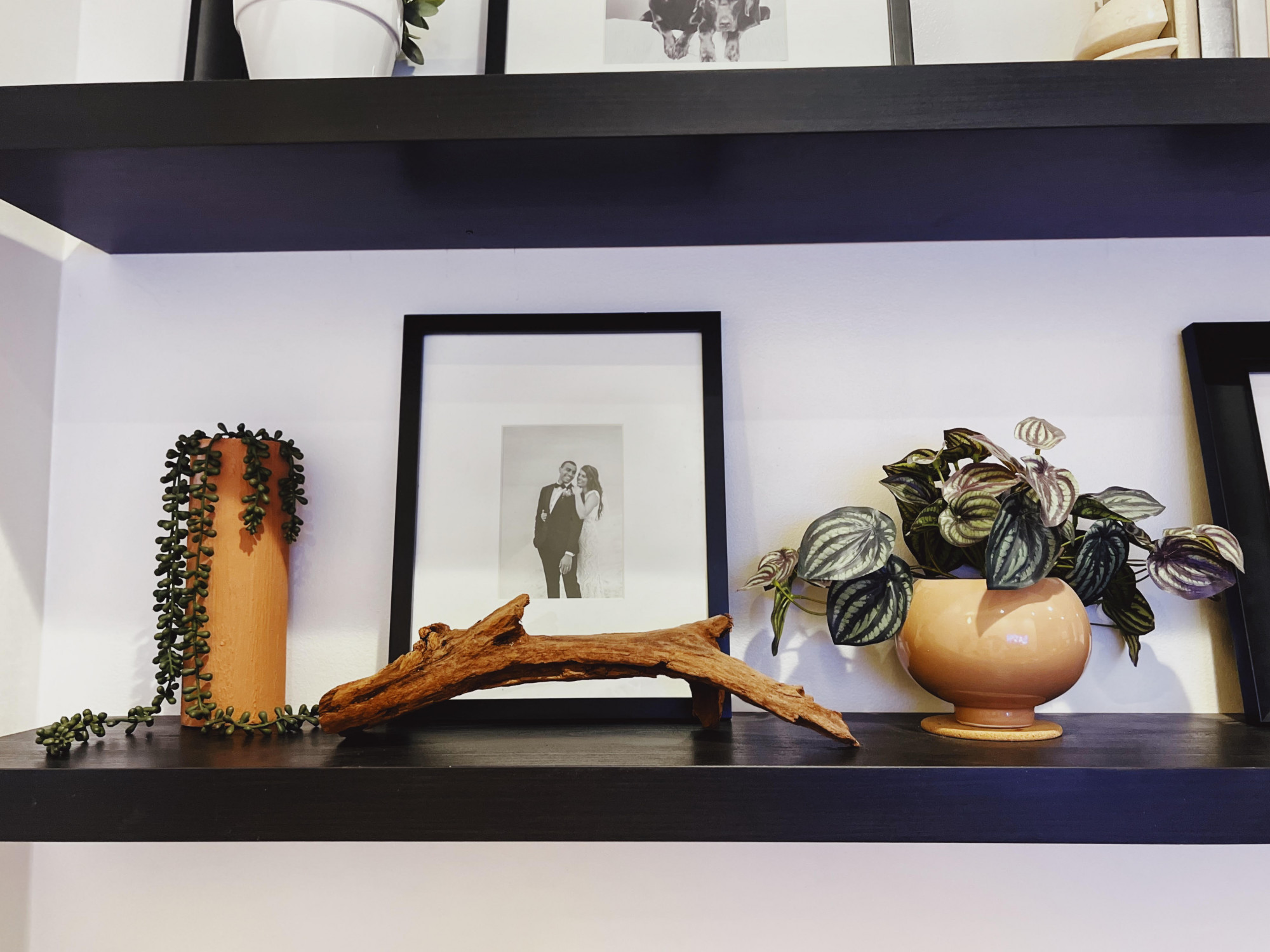
A good way to get comfortable with shelf styling is to practice. Take around 10 decor items laying around your house and start moving them around on two shelves. See what works best. Ask yourself why. Why do you prefer a certain look over another? Try to refer back to my design principles I’ve mentioned above so that you truly understand the reasoning. You’ll be a master before you know it!
